The Reith Lectures were inaugurated in 1948 by the BBC as a ‘stimulus to thought and contribution to knowledge’ and has remained a flagship programme in Radio 4’s broadcasting ever since. The name marks the historic contribution made to public service broadcasting by Lord Reith, the founder of the BBC. John Reith maintained that broadcasting should be a public service which ‘enriches the intellectual and cultural life of the nation’. It is in this spirit that the BBC each year invites a leading figure to deliver a series of lectures on radio, aiming to advance public understanding and debate about significant issues of contemporary interest.
The first BBC Reith lecturer was the philosopher, Bertrand Russell, and in the seventy years since there have been seventy-seven different speakers. Usually a set of four lectures are delivered every year by the invited speaker. In Remarkable Minds nineteen lecturers have been featured by journalist, broadcaster and author, Anita Anand. These span topics across art, science, nature, technology, history, religion, society, culture and politics. In each case a highlight essay from the lecture series has been chosen.
Anita Anand is the presenter of the Reith Lectures. In her foreword to Remarkable Minds she writes:
The Reith Lectures are often controversial, but have also proven themselves to be remarkably presecient too. …
The Reith Lectures not only reflect the time in which they were delivered, but often take a scalpel to the insecurities faced by the world at the given moment. …
Though the subject matter of the Reith Lectures has certainly been diverse, that cannot always have been said of the lecturers. Initially they were exclusively male until Margery Perham, the colonial historian, delivered her lectures in 1961. They were also all white. Robert Gardiner, the Ghanaian professor and economist, who served the United Nations broke the mould in 1965, when he delivered his series of lectures considering the state of race relations internationally. Since then, the effort to find diverse voices from a spread of disciplines, with a wealth of different experiences has been tangible and a real credit to successive Radio 4 controllers.
Remarkable Minds is a wonderful introduction to the variety of subjects introduced and discussed during the Reith Lectures. In fact the entire collection of lectures may be heard on Apple Podcasts. Here is the link.
No big colonial sword needs to come down and slash the fabric of the nation,” …. “Muscle by muscle, atom by atom, we are being torn from within. We are our own bomb.”
Forces of history are at work, he says. Forces too big to fight. He reels off dates. 1947, 1857, 1799. I slapped my head. Spare me. I don’t understand kings and queens. I am a simple man.
…
Slathered on the walls, wrapping all the way around the street. Every shutter, all the way up to the white mosque. It is true. That puffed-up face, like mouldy pastry. The fellow has called us aliens in our own land. He lost the election and we thought, that would teach him. Now here was, his face pasted on my wall.
Award-winning novelist and playwright Annie Zaidi’s novella No Prelude to a Riot is a disturbing, hard-hitting story set in a nameless city. It is about the rising communal tensions and the anxiety of living under constant siege. What comes across equally poignantly is the writer’s own attempts at writing a story that is extremely close to the reality of today. To be writing under a sense of constant siege, where the lines between the fictional characters and plot are blurred, is not an easy task. Sometimes it seems as if the voices of the characters are not strong enough, probably due to the circumstances they live in, yet they do manage to slip in what they have to say, jolting the reader with their pronouncements. It leaves a sinking feeling in the stomach.
Earlier this year Annie Zaidi won the $100,000 Nine Dots Prize for her essay Bread, Cement, Cactus. It will be expanded and published as a short book by Cambridge University Press in 2020. The Nine Dots Prize is a book prize for creative thinking that tackles contemporary societal issues. Entrants for the prize are asked to respond to a question in 3,000 words and the winner receives $100,000 (Rs 69.83 lakh) to write a short book expanding on the essay’s idea. The question this year was “Is there still no place like home?” “Zaidi’s entry, ‘Bread, Cement, Cactus’, combines memoir and reportage to explore concepts of home and belonging rooted in her experience of contemporary life in India, where migration – within the country, especially from villages to cities – is high,” the Nine Dots Prize said in a statement.
Prelude to a Riot is a novella that explores similar concepts of home and belonging while rooted in the very real and disturbing issues of communal violence, a growing intolerance of the other and crumbling of democracy. It is shattering to realise that Prelude to a Riot, Tabish Khair’s Night of Happiness, Nayantara Sahgal’s The Fate of Butterflies and Ravish Kumar’s The Free Voice are critical contributions to contemporary literature, offering perspectives while bearing witness to the current socio-political events.
Recently I heard a couple of brilliant conversations online as well as read a book of interviews with Tamil women writers where all the writers concerned were discussing plot, narrative, structures, methodology, what comes first — meticulous planning or writing, followed by multiple drafts. The conversations also veered towards adaptations and multiple formats of the original story. Also how writers manage their time and focus upon their writing, especially as many of the Tamil women writers mentioned, they also hold day jobs.
The second link is an absolutely brilliant conversation between Leigh Bardugo and Erin Morgenstern at the San Diego Comic Con, moderated by Petra Mayer, Books Editor, NPR.
And the final is a book recommendation. Lifescapes: Interviews with Contemporary Women Writers from Tamil Nadu edited by K. Srilata and Swarnalatha Rangarajan, published by Women Unlimited.
On 24/25 August 2019, Sandeep Raina’s “Where No Daffodils Grow” was published in the Hindu Literary Supplement. Here is the link. Given the space restrictions in print, the article had to be edited. Reproduced below with the kind permission of the author is the unedited version.
Sandeep Raina was born and brought up in Baramulla, Kashmir. He studied engineering in Srinagar, and when in 1990 militancy gripped the Kashmir valley, he finished his education and left for Delhi. He lived in Delhi for 10 years and then in Istanbul for 3 years before moving to Surrey, England where he has been living for the past 15+ years with his wife and 3 children. Sandeep’s wife is a doctor in Surrey, their daughter studies medicine at the University of London, and their twin sons are studying engineering at the Cambridge University.
Sandeep has worked as a senior engineering executive in mobile telecoms for the past 28 years and travels globally for his work. As a mobile telecoms evangelist, he has been invited to speak at many conferences across Europe and the USA, and has published numerous professional articles. Currently, he works for a French-American telecommunications software company in London.
Sandeep has written a novel based on Kashmir, which took him over 11 years to write. The reason to write a novel was that it worked as a slow cathartic process to counter the traumatic and violent experiences of the early-90s Kashmir, and the harsh life of being a migrant/refugee in Delhi. As part of his life and travels outside Kashmir, he has acquired different perspectives of the Kashmir conflict. Through his writing about the Kashmiri people, of all communities, caught in the long-drawn, brutal conflict, he aims to present a better understanding of their predicament.
Sandeep has also published short stories about Kashmir, which reflect the exchanges with people caught in conflicts like Kashmir. They not only highlight the broken relationships, the loss of trust, the rising communal politics of Kashmir and India, but also offer introspection and a hope for the communities that have been disadvantaged because of the strife.
His stories have been published in several magazines and papers, including, The Hindu, The Guardian, The Telegraph, and The Times of India/The Economic Times.
****
Men in tall black hats and flowing black
robes strode briskly down an empty street. Some of them had long side burns and
some had long beards. It was a summer
afternoon, hot, and they were quite overdressed. I was visiting a friend in
Golders Green in London and asked him what was going on, who were those people,
why the costumes?
“Nothing, they are our Jewish neighbours back
from a synagogue,” said the Kashmiri Pandit friend. “Many Jews live here since
the 40s.”
Why were they dressed in such a pronounced
manner? I wondered. Here was I, trying my best to assimilate, just landed in
London. It didn’t make sense.
We had lunch at our friend’s home, typical
Pandit cuisine, mostly lamb dishes: rogan
josh, yakhni and matsch. I had
met him and his wife after many years. We chatted for long on the table,
reminiscing. The flat was sparsely furnished but had a few Kashmiri rugs. I noticed
a small ornate candle stand in the window and asked what it was.
“It is a menorah,” said my friend’s wife. “To light candles in the Jewish
festival of lights, Hanukkah.”
Until then I had thought Diwali was the
only festival of lights.
“Everybody
in this apartment building is a Jew, most of them old,” said my friend. “And
they are very nice people.”
The next day, I told Mike, my colleague in
office, about the Jews in costume. Mike was a small young man, who once had
said that being Jewish, Catholic and French was the worst one could be in
England, and he was all of them. One of his parents was French and Catholic,
the other English and Jewish.
“There are other interesting things that we
do, such as not doing anything on Sabbath,” he laughed. “Not even switching on a
light.”
“Why?” I said.
He didn’t want to explain or didn’t know.
I shouldn’t have been so surprised. In
Kashmir, on days of fasts, women in our Kashmiri Pandit family cooked strict vegetarian
meals, cleaning and praying, and not doing much else. And the fasts followed
the moon’s wax and wane. Punim, aetham, mavas. On full moon, mid
moon, and no moon. There seemed to be much in common with the Jews.
“We
are also really good with money,” laughed Mike.
My grandfather’s father had been a zamindar,
a landowner, in Kashmir. My mother said that he was so rich that he didn’t
count coins, he weighed them out of hand balances. But, my grandfather was not
rich, nor us. My mental comparisons with the Jews ended at this thought.
Years went by. In which my grandfather
died. I hadn’t seen him for a long time, but his memories kept on coming back
to me in many different ways. By now we had moved into a new house, and I worked
for a different company, in a different town in England, where I became
friendly with an older Iranian colleague, Paymon.
It was the Persian new year, on spring
equinox, when the day equals night, and the opposites balance out, when I told
Paymon about Navreh, the Kashmiri Pandit new year. How on the eve, we filled a thaal, a deep plate with rice, milk, yogurt,
a pen, a coin, some lentils, a daffodil. Bits that made life.
“We do something similar on Navroz, and we
call it haft seen,” he said, surprised.
I felt a sudden connection build. We discussed
Navroz and Navreh in snatches between meetings, across our office desks, on the
coffee machine. Iran is so far from Kashmir, but it suddenly felt close. I told
Paymon about the chinars, the papier-mâché, and the floral woollen carpets that had travelled from Iran, and
the origins of rogan josh. Things began to tumble out. I even snatched a paper
napkin and wrote my name in Nastaliq, the script that had travelled from Iran to Kashmir.
“I didn’t know this,” he laughed.
I didn’t know either, when growing up in
Kashmir. If it’s a part of you, you don’t think much of it. I remembered my grandfather.
I remembered his bold loud voice, his very sociable manner, his rambling
conversations, his strong physical presence, his eloquent Farsi.
Grandfather used to recite Farsi couplets
when he was in a good mood, when he had an audience, which could be my reluctant
father or a hapless neighbour who had chanced to step by. Grandfather rolled
off the Farsi couplets with the same verve as chanting mantras in Sanskrit,
when he did his puja every morning, with
lots of flower petals and incense sticks, in front of an array of gods. I was
small, the Farsi and the Sanskrit both sounded magical to me, inspiring awe.
I told Paymon all this in the office
canteen, and he listened to me with an older man’s patience.
My euphoria was unabated. For a Foodie
Friday in the office, I woke up early and cooked rogan josh in the morning over
low flame for three hours. My wife
wasn’t happy that I hadn’t let her cook. I packed the rogan josh carefully in a
large plastic box, with a sticker on top and wrote- Kashmiri Rogan Josh in my wobbly Nastaliq, and sped to office, just
in time for lunch. My colleagues had already begun eating, and there were foods
of all kinds on the large canteen table. Italian, Greek, English, Brazilian,
Welsh, Indian, Iranian. The rogan josh was late. Then Paymon saw me.
“So, you can read and write Farsi?” said Paymon,
looking at the sticker, asking me to put some rogan josh on his plate.
“I can’t,” I said. I couldn’t even read and
write Kashmiri.
Rogan josh disappeared fast, everyone ate
it. It was declared the best cooked food on that Friday. I brimmed with pride.
When I left that job, on my last day, Paymon
wrote four lines in Farsi on my farewell card. Under those he wrote in English:
Thank you for enlightening me about
Persian Kashmir. It has been great talking with you. It is sad to see you go
but I wish you all the best.”
I think Paymon said something about those
Farsi words in the card, but in my farewell hurry, I didn’t hear too well.
The card remained unread for years. Later,
I wished I had learnt some Farsi, some Nastaliq from my grandfather. I
wonder why I didn’t. My question took me back to a faint conversation from my
childhood. I was reading out two Kashmiri words written in Nastaliq on a
ten rupee note. In those days, currency notes in India had the value written in
15 official languages, each in its own script.
“Dah
ropiye,” I read out, trying to decipher the curls,
whirls, and dots.
“It’s not dah ropiye, its duh ropiye,”
said my mother.
“What’s the difference?”
“Muslims say dah, but Pandits say duh,
because dah in Sanskrit means cremation. And
Muslims bury their dead.”
My mother also told me that the ancient script
for Kashmiri was Sharada, now dead, and nobody knew what it had looked like.
Pandits and Muslims had other differences
too. I was aware of some. My pheran, the
long woollen garment that I wore in winters, had an extra fold, ladh, near its hem, while Bitta, my Muslim
friend’s pheran fell straight. My grandfather wore a pajama, not a shalwar. My
great grandmother’s pheran was ankle-length, with long sleeves, while old Muslim
women wore knee length pherans, and shorter sleeves.
Many differences, all small. Until someone
powerful outside Kashmir, heard about the tiny twists of tongue, the lengths
and folds of pherans. And questioned if Kashmiri had more Farsi or more Sanskrit?
Whether its script was Nastaliq or Sharada? When the powerful became more powerful with this
knowledge, a powerless man in a tempo bus, after a squabble over a seat, called
my grandfather a kafir, godless. Hurled
the word like a weapon. I was with my grandfather in that bus. I had seen him
pray to God every morning, in fact, many gods. My proud grandfather’s face was livid,
his complaint to the bus driver a mere mumble. I remember my own inertness, the
tremble in my fingers.
Not much later, a powerless young boy, just
out of teens, gunned down my grandfather’s nephew and niece, my mother’s
cousins, with their partners, inside their home. We fled Kashmir.
It’s been 29 springs since that happened. This
year, in London, I forgot to fill up the Navreh thaal. Or look up the new panchang, the Hindu calendar book, which
my mother posts from India every spring. On Navreh eve, when I was small in
Kashmir, I would run out to pluck a handful of nargis, white daffodils, that grew in our garden. They had the
sweetest of scents, but I wasn’t allowed to sniff; they were meant for God. And
on Navreh morning, when the April air pinched my winter-chapped cheeks, I would
wear a new kurta-pajama. Forgetting the thaal has brought sweet nostalgia and tremendous
guilt.
Pictures of Navreh thaals flooded Facebook,
on cue. Rice, milk, yogurt, coin, pen. No daffodils. Where most Kashmiri Pandits
now live, daffodils don’t grow. A panchang said the year is 5094 by the Saptrishi
calendar, 2075 by the Vikrami calendar.
“29 by the Pandit exile calendar,” a friend
messaged. My heart stopped for a long moment.
On the cover of a panchang, I saw a script
that I had never seen before. Sharada. It had fonts like thick brush strokes or
like engravings on stone. Blurry, awoken from a deep sleep.
I had read a book long ago about the
revival of Hebrew after the Jews had fled from European towns. How Hebrew was
invoked to string the scattered Jews. How they would all go home, with a common
language and a new script to a land they could call their own. In a desert.
I think of Thar or Kharan, when I think of
deserts. One on the India-Pakistan border and the other on the Pakistan-Iran
border. I grew up with snow and mountains, I grew up with lush fields, streams
and lakes. What would I do in a desert? What if someone powerful traced my
roots to the Aryan Iranians? And sent me to Kharan in Balochistan. Would I go?
Would my children go? Would my children’s children go?
I am sure the Jews had said this too.
I thought about Iran. I remembered my
conversations about Navroz and Navreh with Paymon. I hunted for the farewell card
from my last job and found it in a stack of birthday cards that our children
had given me over the years. Among dozens of messages written in English was
the quatrain written by Paymon in Farsi, in flowing Nastaliq. Asking to be
read.
I messaged a photo of the lines to Paymon,
asking him if he could translate it for me. Paymon did not reply, I don’t know
why. I had thought Paymon would be a friend for life. Friendship’s a promise. I
thought of who else could help me: Grandfather. But he was not around anymore to
fill me with the awe and magic of his Farsi. Not hearing back from Paymon, not able
to read his message brought a deep sense of loss. Like a forgotten Navreh. Like
a broken promise.
I asked an English friend to help me. He
sent a photo of the Farsi message, all the way to Tehran to his sister-in-law.
A week later, I received the transliteration and the translation in my inbox.
Grandfather appeared before me. And read out in a bold, loud voice:
Yari
keh beh nazd e oo gol o khar yekist
Dar
maz hab e oo mos haf o zonnar yekist
Ma ra
gham e on yar che bayad khordan
Koo
ra khar e lang o asb e rahvar yekist
(Rumi)
“A friend who sees no difference between a flower
and a thorn,
In whose religion, the Quran and Zonnar are
the same,
Why should we worry about him?
As for him, a lame donkey and a swift horse
are the same.”
Zonnar used to be a girdle which Jews wore to
distinguish them from Muslims, long back in time.
Paymon had not forgotten, he had kept his
promise, he had written me a message to remember for life. Like a true friend,
he knew me more than I knew myself.
A few days later, I pulled out a pheran from
my clothes cupboard, which my wife had bought from a Kashmiri trader many years
ago. It is dull brown and woollen, a bit scratchy at the neck, and it does not have
a Pandit fold near the hem. I had never worn it.
That summer day, I wore it. It warmed me up.
I looked at myself in the mirror, and the image of the Golders Green Jews
walking briskly down a street flashed in front of my eyes. Now I knew why they were
dressed like that.
What they were holding on to.
Next spring, I won’t forget Navreh. I will fill
up a thaal with rice, pluck a yellow daffodil from our English garden, place a
pound coin, a pen and an idol of a god in the thaal. Some milk and yogurt too. And
pray. That I’m not sent to a desert.
Book Post 44 includes some of the titles received in the past few weeks. Wherever available Amazon’s Kindle widget has been embedded in the blog post. It will allow you to browse through the book before you decide to buy it.
Book Post 43 includes some of the titles received in the past few weeks. Wherever available Amazon’s Kindle widget has been embedded in the blog post. It will allow you to browse through the book before you decide to buy it.
Ahlawat Gunjan has a Master’s Degree in Graphic Design from The Glasgow School of Art, UK. Previous to that he also spent a semester at Indiana-Purdue University, USA focusing on design thinking and leadership. He is a graduate of the National Institute of Design, Ahmedabad.
Trained at Lars Mullers Switzerland and Faber & Faber, UK, Ahlawat has a varied and interesting work experience. His overlapping interests in art and literature not only made him pursue a career in publishing but also informs his keen interest in visual authorial interventions and curatorship. This allowed Gunjan to shape the visual personality of the book at every step of its creation. Ahlawat also enjoys the many ways and levels at which a designer can take narrative construction forward through type and image.
He heads Design Department at Penguin Random House, India during the day and spends time painting in the evenings and over the weekends.
Following are edited excerpts of an interview conducted via email:
1.How did you get into the world of publishing?
It was a beautiful accident. My first job was with Hidesign in Pondicherry and I wanted to move closer to home. So, I was looking for opportunities in Delhi and DK happened. I was really enjoying the process of book making, image editing, and managing large book design projects. And I’m rarely satisfied. So, I wanted to try out my hands on a few book covers for Penguin (which used to be next door really in Panchsheel). I still remember being nervous asking my then manager and now Managing Director, DK India, Aparna Sharma, and she was absolutely open to the idea and very encouraging. I did one cover and it went off very well and this was the start of a new journey. I went on to do four more covers and discovered a sort of hidden joy in myself. I realized I really wanted to do this for living now. With huge support from DK and Penguin, the switch happened and I made Penguin my home thereafter. My masters at The Glasgow School of Arts was focused on publishing and as a part of it, I was extremely lucky to intern at Lars Mullers in Switzerland and later at Faber and Faber. This is how publishing happened to me and today, honestly I can’t imagine myself in any other domain of Graphic design.
2. What in your opinion are the basic elements of designing a book cover?
Since seeing comes before words, I would say strength and clarity are foremost and non-negotiable. By strength, I mean the ability of the cover to draw your attention towards it and clarity is the ability (through image and typography) to communicate the message clearly and effectively. The rest happens between these two.
3. Are there a set of basic ground rules that a book designer should be aware of before delving into a new project?
Be courageous and have
conviction.
Design and not decorate.
Allow things to evolve.
4. Do you think the basic principles of book designing have undergone a massive transformation since the medieval ages or is it that the modes of production have transformed the process?
Since medieval ages, absolutely. That time we used
to have decorative leather bound books with very less variations in terms of
size and colour palette. Margins and page settings were dictated how monks
would hand write the contents.
With Guttenburg’s invention, the game changed
entirely. With printing press, movable type blocks were introduced for mass
production. One can see a lot of illustrated elements like decorative
capital letters, but what was missing was para spacing, line spacing, leading
and all forced justified text which made the whole page pretty hard to read. It
was the time when publishers were the printers and often wanted to show their
abilities that were boring, hard to read and based on little showing off.
Designs that wouldn’t enhance the text. By 1700s, printing became somewhat
common to the masses.
By 1800s, there were authors and fine artists who
were involved and commissioned to design and set the books. They introduced the
notion of foot notes, side bars and paste numbers. This was the time when the
economics of making a book took some precedence, which until now was secondary.
1900s saw several design schools mushrooming all over Europe and USA, with
their respective design philosophies (It is very evident even today. For
instance, the way Swiss or Dutch people approach design and produce their books,
with very strong and distinct typography, imaging and very high production
quality).
So, on the whole with turn off every century, book designing saw their own changes.
5. How important is it to know typography as well as different art forms to design a book cover/ book? If yes, what are the fonts for which you have a soft corner?
Author assigns certain voice to their characters and as a book designer we have to assign visual voices to those characters. So, you can understand what a narrative can do without a voice or having a wrong voice. I believe the relationship between the cover design and the text is very special. This is because a font, colour or layout is not chosen solely in function of its legibility but principally for its associative capacity. The classic problem of semiotic theory is that a single image expresses more than a thousand words, and a single word conveys more than a thousand images. (p. 116 Devleminck, Steven, Gobert, Inge, Looveren Johan Van. The Balancing Act of Design )
It’s the backbone of a good cover and I strongly
believe in it. Infact, I went to do a summer intensive typography course at the
Royal College of Arts, London fairly recently.
I do have some favourites fonts, but I’m trying to work with as few as four/six.
6. Has digital technology made a qualitative difference to book covers?
Yes, your work can reach an unimaginable amounts of readers (say FB, Instagram and other social medias, people tagging etc.), which wasn’t the case 10 years back really. Additionally, unknown readers reach out to you on Facebook, Instagram, Amazon review with their compliments, which is very satisfying and encouraging.
7. What is it that you seek in a book cover design?
A space to negotiate, collaborate, and construct
ideas/thoughts and above all space to create! I try to be in author’s
shoes to see and feel the writings, to basically try to get the pulse of every
possible detail and to assure them that we are equally excited about your work
and at the end, making them hand over the controls to you. These are far more
fundamental than deciding which fonts to use, what leading is better for a book
cover, and so on and so forth.
A designer has a certain accountability and his/ her actions have enormous impact on millions of readers. Without knowing, they become a part of the design and literary history. Along with all the fun you may have, it’s also a huge responsibility on your shoulders, because you are going to give a visual personality to someone’s years of work. Additionally, this will go to print and will be out there for years to come (unlike the digital format, where you can change details quickly). A book cover designer needs to understand that the author’s work is linear but the images on the cover are associative. The challenge is to add layers through visual intervention with type and image. That means, apart from giving a structure, designer can control the reader to read the content in certain way. In other words, the designer holds a remote control to direct the reader a certain way.
8. What is your ideal brief for a book cover design? What are the elements it must absolutely contain and what are the elements that would be bonus if included but are not that necessary?
We have a standard cover brief format at Penguin
and we get written cover briefs from our editors. But, I always believe in
having a detailed chat with the editor, sometimes with the author and the sales
team also, before I start thinking and researching for the cover. I feel, this
way I get the best results!
It’s helpful to have all the elements pertaining to
the cover:
Format (HB or PB), size, spine width, budget, extracts to read along with visual suggestions and any additional inputs from the author and Sales.
9. What are the cost considerations of creating a book cover design?
We do work with certain budget per cover and depending upon the design ideas, we sometimes push and pull. For instance, if a designer got a cover design that is dependent on post-press effects (embossing, die-cuts, debossing, Pantone colours) or wants to use unusual stock or slightly extensive printing technique, then we do push the cost boundaries to make it happen. I think it’s about how much we collectively believe in that book and it’s linked to the way we are positioning that particular book.
10. How do you manage to maintain a freshness of style especially with the play of light in most of your compositions? What are the mediums you are partial to — watercolours, acrylic, ink etc.?
My mentor Lars Müller says, “We are authors
while designing. Design is our language. And I must reflect my beliefs”. I
start each book cover design project from scratch, from reading the manuscript
to researching about visuals, fonts I will be using or drawing, discussing the
ideas with editors and authors. My way is slow, simple and uncluttered, as
already there is enough visual pollution both in typography and imaging. Both
of these are art and science and one should strive for simplicity.
No, I’m not partial to any medium when it comes to designing a cover. It has to be absolutely objective and true to the contents inside.
11. What would you claim to be your signature style in creating an art work, may it be canvas or a book cover? For Turner it was the playing of paper and colours. What is yours?
I like making my own imagery for the covers. Originality is one feature that plays an enormous role in my designs. In this age and date where everything is a click away, one seems to think that they have browsed through similar visuals. To arrive at something that is startlingly unconventional and refreshing, the process of thinking needs to be unconventional too. Therefore, one must embrace ambiguity and not kill any idea that one has. I always say it is better to produce an ugly cover but it should be an original. “I prefer ugly covers to clone covers. At least ugly covers demand a certain amount of attention. And will continue to be ugly. In other words, today’s ugly is tomorrow’s beautiful,” says Peter Mendelsund and I can’t agree more to this.
12. Who are the artists and book designers who have influenced you?
My absolute favourites are Irma Boom, Adrian Shaugnehhesy (just spent a
week with him in London) and Peter Mendelsund (my ex-colleague from Knopf,
USA).
Artists: David Hockney, Ivon Hitchens and Amrita Sher Gil. I can’t do without them!!
13. Can you share examples of book covers that you consider iconic?
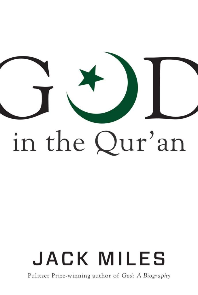
Gun Island by Amitav Ghosh, Gandhi by Ramchandra Guha, Premchand series, Indica by Pranay Lal, Moong Over Microchip by Venkat Iyer, God in the Quran by Jack Miles (Knopf US), Trampled Under Foot by Barney Hoskins (Faber and Faber) and The Room on the Roof by Ruskin Bond (anniversary edition).
It has to be the oddest concatenation of events that when the abrogation of Article 370 was announced by the Indian Government on 5 August, I was immersed in reading Colson Whitehead’s The Nickel Boys and Mirza Waheed’s Tell Her Everything. Two mind-blowing powerful novels that are only possible to read when the mental bandwith permits it. Colson Whitehead’s novel is as darkly horrific as it imagines the time in a reform school when racial segregation was openly practised. It is extremely disturbing to read it Mirza Waheed’s novel is an attempt by the narrator to communicate to his daughter about his past as a doctor and why he chose to look the other way while executing orders of the powers that be. Orders that were horrific for it required the narrator surgical expertise to amputate the limbs of people who had been deemed criminals by the state. Tell Her Everything is a seemingly earnest attempt by the narrator to convince his estranged daughter that what he did was in their best interests, for a better life, a better pay, anything as long as his beloved daughter did not have to face the same straitened circumstances that he was all too familiar with while growing up. It is the horror of the justification of an inhuman and cruel act by the surgeon that lingers well after the book is closed. Such savage atrocities are not unheard of and sadly continue to be in vogue. And then I picked up Serena Katt’s debut graphic novel Sunday’s Child which tries to imagines her grandfather’s life as a part of Hitler’s Youth. She also questions his perspective and the narrative is offered in the form of a dialogue. She refers to the “chain hounds” who hunted, and executed, deserters. Something not dissimilar to the incidents documented in The Nickel Boys too.
Then this month’s issue of National Geographic magazine arrived. It’s cover story is on migration and migration called “World on the Move”. In it the writer Mohsin Hamid has an essay, “In the 21st century, we are all migrants“. We are told not only that movement through geographies can be stopped but that movement through time can be too, that we can return to the past, to a better past, when our country, our race, our religion was truly great. All we must accept is division. The division of humanity into natives and migrants. … It is the central challenge and opportunity every migrant offers us: to see in him, in her, the reality of ourselves.”
To top it I read Michael Morpurgo’s Shadow. It is about the friendship of two fourteen-year-olds, Matt and an Afghan refugee, Aman. Shadow is the bomb sniffer dog who adopted Aman as he and his mum fled Bamiyan in Afghanistan from the clutches of the Taliban. The mother-son pair moved to UK but six years after being based there were being forcibly deported back to Afghanistan despite saying how dangerous their homeland continued to be. Shadow, a young adult novel, is set in a detention camp called Yarl’s Wood, Bedfordshire, UK. While terrifying to read, Morpurgo does end as happens with his novels, with a ray of hope for the young reader. Unfortunately reality is very different. So while helping tiddlers connecting the dots with reality is a sobering exercise for them, it can be quite an emotional roller coaster for the adults.
In an attempt to look the other way, I read a delightful chapter book called Tiny Geniuses : Set the Stage! by Megan E. Bryant. It is about these historical figures who are resurrected into present day as mini figures by a couple of school boys. In this particular book, the two figures wished for are Benjamin Franklin and Ella Fitzgerald. It can make for some amusing moments as the school boys try and complete their school projects. A delightful concept that is being created as an open-ended series arc. It did help alleviate one’s gloomy mood a trifle but only just.
Read this literature with a strong will, patient determination and a strong stomach. Otherwise read the daily papers. For once you will find that the worlds of reality and fiction collide.
http://bit.ly/30ijzI1 Scholastic India’s forthcoming release in September 2019 includes Nadya by Debasmita Dasgupta. It is an absolute must read. It is stupendously breathtaking.
As Orijit Sen affirms ‘Nadya takes us deep into the heart and mind of an adolescent girl as she negotiates her way through love, heartbreak and pain before finding renewal. The stunning artwork—with its rich landscapes, quiet but glowing colours and sensitively portrayed characters—makes the turning of each page an act of revelation. The beauty and power of graphic storytelling at its best!’
Krishna in Rhymeis a fabulous retelling of the story of Krishna by Kairavi Bharat Ram and Ananya Mittal, published by Scholastic India. It is in couplets. Ishan Trivedi’s sumptuous illustrations fit so beautifully with the text, making the reading experience magical. Gift it now. Gift it in Diwali hampers. It is a book for children and adults to read, whether already familiar with the stories or not, is immaterial.
He is always remembered for the fun he had, For being a playful god, beyond the good and the bad.
He represents the child in us, who enjoys life and is free, He’s the balance between fun and responsibility.
He taught us that to your fate you are bound, This idea’s called karma, what goes ’round comes around.
The Gita is perhaps his most famous speech, In this all about duty and dharma he does teach.
When you do what you must, things will always be okay, Following your heart will never lead you astray.
We hope this epic story you all have understood, Remember this forever: evil never beats good.